Why Can Pearl Colors Look Different in Photos and in Person?
Pearl colors can look different in photos and in person because a pearl is not a flat, opaque color sample. Its appearance changes with the light source, viewing angle, reflections, background, camera white balance, exposure, editing, and the screen used to display the image. Subtle overtones and iridescence can become stronger, weaker, warmer, cooler, or even seem to disappear as those conditions change.
The Quick Answer: Some Color Difference Is Normal
If a white pearl looks slightly rosier in a studio photo, creamier under warm indoor light, and cooler beside a window, that does not necessarily mean the pearl has changed color or that the photograph is inaccurate. The viewing conditions have changed.
The most useful way to think about pearl color is this: a pearl has physical color characteristics, but you only see them through a particular lighting and viewing environment. A good product photo should represent those characteristics honestly, but no single image can reproduce every way the pearl will look in real life.
| What changes | What you may notice | Is it usually normal? |
|---|---|---|
| Warm vs. cool lighting | White pearls look creamier, rosier, grayer, or cooler | Yes |
| Viewing angle | Overtone or iridescent color becomes stronger or weaker | Yes |
| Background and nearby colors | The same pearl appears warmer, cooler, brighter, or darker | Yes |
| Camera white balance and exposure | Photo shifts yellow, blue, green, magenta, light, or dark | Common, but photography should control it |
| Editing or phone processing | Color and contrast may look stronger than in the original scene | Possible; the degree matters |
| Different screens | The identical image looks different on two devices | Yes |
Pearl Color Is More Than One Simple Hue
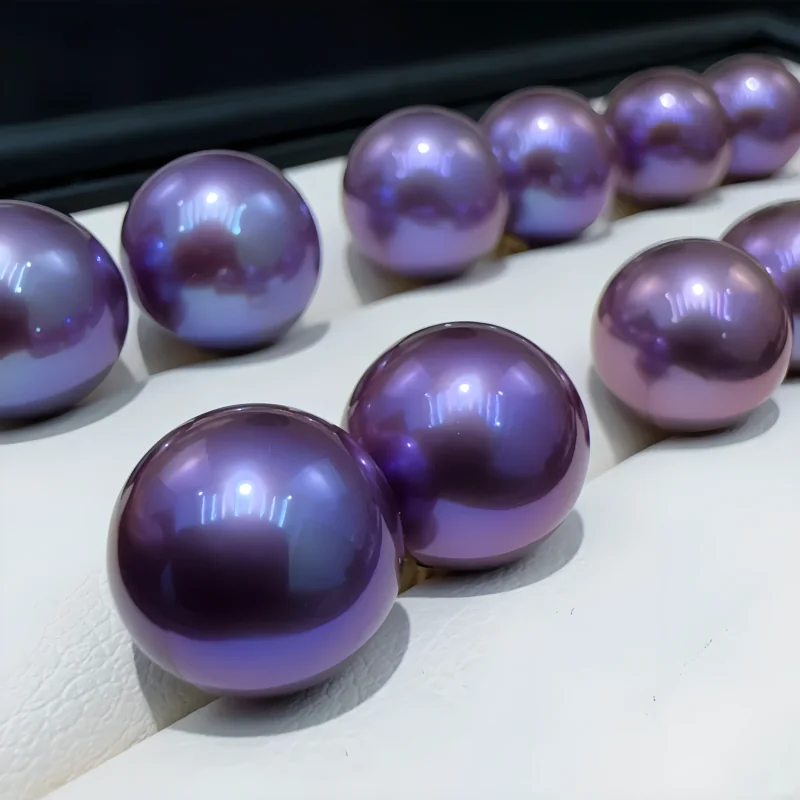
One reason pearls are difficult to photograph accurately is that gemological pearl color is layered. GIA describes pearl color in terms of bodycolor, overtone, and, in some pearls, orient.
- Bodycolor is the dominant overall color, such as white, cream, gray, yellow, pink, or black.
- Overtone is a translucent secondary color that appears over the bodycolor. A white pearl, for example, may show a rosé or greenish overtone.
- Orient is a shifting, iridescent display of multiple colors on or just beneath the surface.
These effects are related to how light interacts with the many thin layers of nacre. Orient in particular is not meant to look identical from every direction: the colors can shift as the pearl, the light, or the viewer moves. This is part of why a pearl can feel more dimensional in the hand than in a still photograph.
If you want a broader foundation for judging appearance, it helps to separate color from other value factors such as luster, surface, shape, and matching. See our guide to evaluating pearl value.
1. Lighting Can Change the Color You Perceive
Light is probably the biggest reason a pearl looks different from one environment to another. The light illuminating an object has its own color characteristics, intensity, direction, and softness. Because pearls are reflective and nacreous, those differences matter more than many buyers expect.
Warm and cool light create different color casts
Warm household bulbs can push a white pearl toward cream, yellow, or soft pink. Cooler daylight or some LEDs can make the same pearl look whiter, grayer, or slightly bluish. Fluorescent or mixed lighting can introduce less intuitive green or magenta casts.
Your eyes partially adapt to the color of the room, which is why a white wall may still feel “white” under several kinds of light. A camera has to interpret that light through its white-balance setting. If the camera interprets it differently from your eyes, the photograph can shift even further.
Light direction and softness change what the surface reveals
A pearl with strong luster acts like a tiny curved reflector. Large, diffused light sources can produce broad, soft reflections and reveal subtle color transitions. Small or harsh sources may create bright specular highlights that hide part of the bodycolor. Very flat lighting can reduce contrast so much that the pearl loses some of its depth.
This is why a studio photo may reveal rosé, green, silver, or peacock overtones more clearly than ordinary room light—or, if the lighting is poorly controlled, may suppress them.
The viewing angle matters
Turning a pearl changes the geometry between the light, the nacre surface, and your eye. On pearls with noticeable overtone or orient, a small rotation can reveal a color flash that was nearly invisible a moment earlier. A single photograph freezes only one of those viewing angles.
2. Backgrounds, Skin Tone, and Surroundings Also Affect Appearance
Pearls reflect their surroundings. A glossy white pearl photographed next to warm wood, a red phone case, green clothing, or a photographer wearing a brightly colored shirt can pick up some of those colors as reflections. Dark Tahitian pearls can be even more sensitive to the shapes and colors reflected around them.
There is also a perceptual effect: our visual system judges color in context. Put the same pearl on a bright white background, then on beige, gray, black, or skin, and its apparent warmth and contrast can change even if the pearl itself has not.
For online comparison, a neutral gray or white background is useful because it reduces distractions. A second photo on skin or in normal wear is still valuable, but it answers a different question: how will this pearl look in context?
3. Cameras Do Not Record Color Exactly the Way Human Vision Does
A digital photograph is an interpretation of the scene. The camera captures sensor data, applies white balance and a color profile, chooses exposure and tone rendering, and often adds automatic processing before you ever see the image.
White balance can push every color warmer or cooler
White balance tells the camera how to interpret the color temperature of the light. If it is set too warm or too cool—or if automatic white balance makes a poor decision—white pearls can quickly shift toward yellow, blue, green, or magenta. This is especially noticeable when the difference being photographed is subtle to begin with.
Exposure and contrast affect how saturated the pearl looks
A brighter exposure can make pale pearls look whiter and reduce visible saturation. A darker exposure can make gray, green, purple, or golden tones look deeper. Increasing contrast can make luster look more dramatic, while reducing it can make a pearl look flatter and softer.
Phones may process the image automatically
Modern phones routinely adjust highlights, shadows, local contrast, color, sharpening, and dynamic range. Those changes can make a product photo attractive, but they can also make a delicate pearl overtone look stronger or cleaner than it appears under ordinary viewing conditions.
This does not mean all editing is misleading. In accurate product photography, editing is often necessary to correct the camera back toward the appearance of the real object. The problem is not editing itself; the problem is editing that makes the pearl materially more saturated, brighter, cleaner, or differently colored than the item being sold.
4. The Screen Adds Another Layer of Variation
Even a carefully photographed and accurately edited pearl can look different after the image reaches the buyer. Different monitors and phones reproduce color differently, and display settings can change brightness, white point, saturation, and contrast.
Color-managed workflows use device profiles to reduce these differences, but most shoppers are not viewing product photos on calibrated reference displays. A photo may therefore look slightly warmer on one phone, cooler on a laptop, and more saturated on another screen.
For web images, consistent color management and an appropriate web color space help, but they cannot make every uncontrolled consumer display identical.
Which Pearls Tend to Show These Differences Most Clearly?
Any pearl can change appearance with the environment, but the difference is easier to notice when the pearl has subtle secondary colors or strong iridescence.
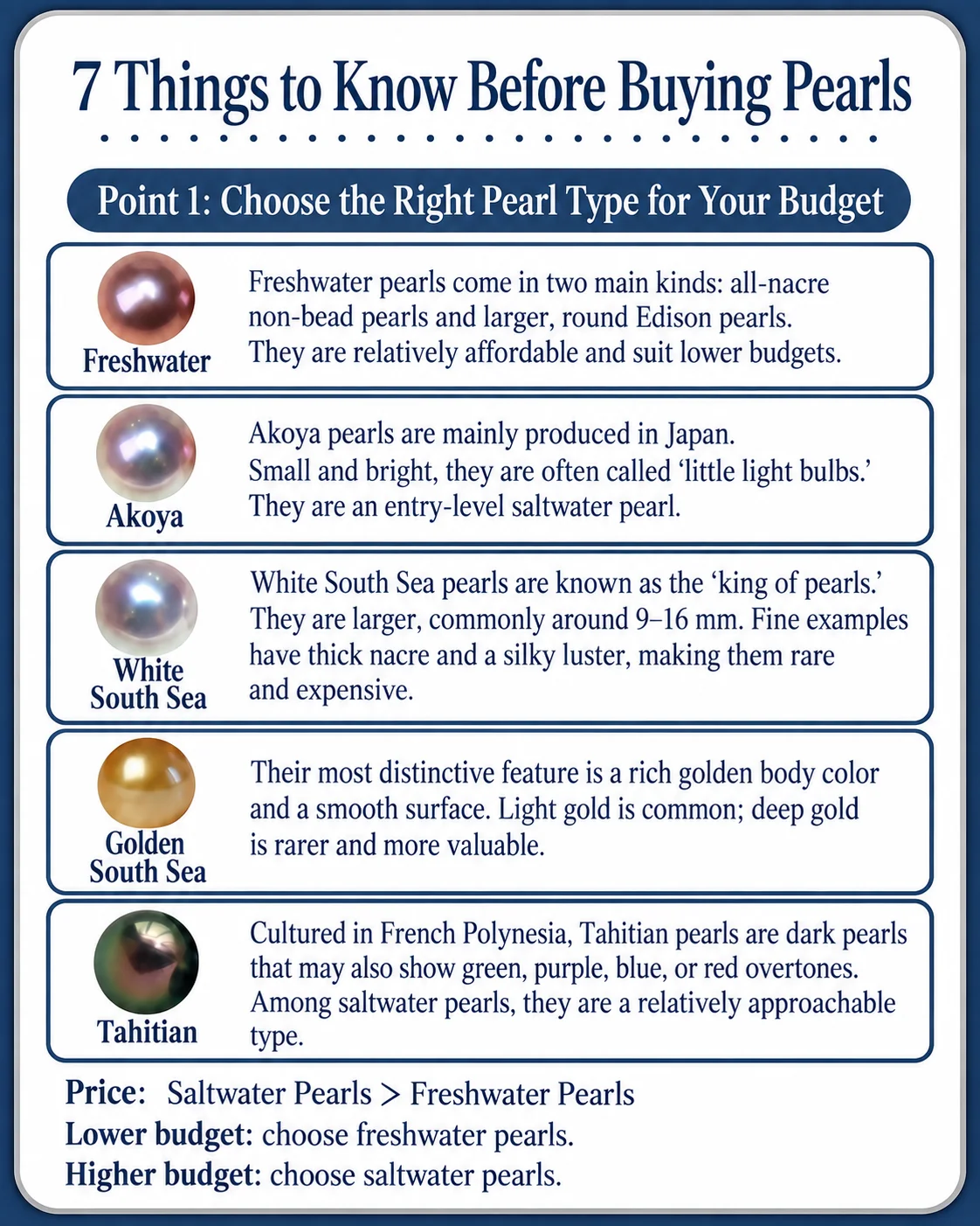
- White Akoya pearls: a rosé, cream, or silver overtone can look stronger or weaker depending on the light and white balance.
- Tahitian pearls: green, blue, violet, bronze, and peacock-like overtones can shift noticeably with angle and reflection.
- Natural-color freshwater pearls: pink, peach, lavender, and related tones can move warmer or cooler depending on illumination and background.
- White South Sea pearls: silver, neutral white, and warmer undertones may separate more clearly in neutral light than under warm store lighting.
- Golden South Sea pearls: exposure and color temperature can make gold look paler, deeper, more yellow, or slightly more orange.
These are tendencies, not guarantees. Individual pearls vary. The key is to judge the actual pearl rather than expecting every pearl in a named color category to reproduce one fixed digital color.
How Much Difference Between the Photo and the Pearl Is Reasonable?
Some variation is expected. But “pearls change with lighting” should not become an excuse for a listing that bears little resemblance to the product.
| Usually understandable | Worth asking about |
|---|---|
| White looks slightly creamier or cooler | A pale pearl arrives dramatically darker than every listing image |
| Rosé or green overtone is weaker in household light | An intense color shown in photos is barely present under several reasonable lighting conditions |
| Tahitian overtones shift with angle | The listing uses only one highly saturated angle and avoids showing the bodycolor |
| Phone and monitor versions differ slightly | Multiple product photos of the same item have inconsistent color with no explanation |
| Studio lighting reveals more surface color | The seller will not provide a neutral-light photo of a high-value item when color is a major selling point |
Also remember that a photo cannot reliably establish whether a pearl's color is natural or treated. Color treatments exist, and appearance alone may not be enough to identify them. If treatment status matters to your purchase, look for clear seller disclosure and, for consequential cases, appropriate gemological testing. Our overview of pearl color enhancement treatments explains that issue separately.
How to Judge Pearl Color More Reliably When Buying Online
If color is important to you, do not try to solve the problem by looking for one supposedly “perfectly accurate” photograph. A better approach is to ask for several views that reveal how stable—or changeable—the pearl's appearance is.
- Confirm whether the photo shows the actual pearl. Sample images are less useful when natural color variation matters.
- Look for a neutral-light image. Diffused daylight or a controlled neutral studio setup is more informative than only warm showroom lighting.
- Ask for more than one angle. This is especially important for Tahitian pearls, strong overtones, orient, and baroque surfaces.
- Use video as supporting evidence, not absolute proof. Motion can show color shift, but the camera and screen still process the image.
- Compare the pearl against a neutral background. A gray or white reference makes color casts easier to notice.
- View the photos on more than one screen if the distinction is subtle. If one device looks dramatically different, the display may be part of the problem.
- Judge color together with luster. A high-luster pearl can look more vivid because its reflections are sharper; that does not necessarily mean its bodycolor is more saturated.
- Ask how the seller describes bodycolor and overtone separately. “White with rosé overtone” is more informative than a vague label such as “pink-white.”
If you are trying to identify a pearl type or judge authenticity from photographs, color should be only one clue. See our broader pearl identification guide for the limits of visual inspection.
What More Accurate Pearl Photography Looks Like
For sellers, the goal should not be to make a pearl look identical under every possible condition. That is impossible. The goal is to create a representative, repeatable image and give buyers enough context to understand how the pearl may vary.
A practical product-photography workflow is to use controlled, diffused light; avoid mixing light sources with very different color temperatures; set or verify white balance with a neutral reference; keep exposure consistent; edit while comparing the image with the actual pearl; and use a color-managed web workflow. For important color-driven pieces, showing both a neutral studio view and a normal-wear view can be more informative than trying to force one image to do everything.
Pearl photography is particularly sensitive to reflections because luster itself is the intensity and sharpness of reflected light. If you want to understand why the material behaves this way, our guide to the physical and chemical properties of pearls provides useful background.
There Is No Single “True Color” Photo for Every Viewing Condition
A useful distinction is between accurate representation and identical appearance. An accurate photo should preserve the pearl's real bodycolor, believable overtone, luster character, and overall visual impression under the stated conditions. But the pearl will not look identical under sunlight, cloudy daylight, warm indoor bulbs, jewelry-store LEDs, a phone camera, and every consumer screen.
That is not a defect unique to pearl photography. It is simply more noticeable with pearls because nacre produces reflective, layered, and sometimes iridescent optical effects. The best online listings therefore show a reasonable range of views rather than pretending the pearl has one fixed RGB color.
FAQ
Does a color difference mean the seller edited the photo?
Not necessarily. Lighting, camera white balance, exposure, reflections, and your screen can all create visible differences. Editing is also a normal part of color correction. The concern is excessive editing that materially changes the pearl's color, saturation, luster, or surface appearance.
What lighting is best for checking pearl color?
Neutral, diffuse lighting is generally the most useful starting point because it reduces harsh reflections and strong warm or cool casts. It is also helpful to inspect the pearl under a second everyday lighting condition so you understand how it will actually look when worn.
Can a phone video show a pearl's true color better than a photo?
Video can be useful because movement reveals how overtone, orient, luster, and reflections change with angle. However, a phone still applies white balance, exposure, processing, and compression, so video is supporting evidence rather than a perfect color reference.
Why does my white pearl look yellow at home?
Warm indoor lighting is a common reason. A white or slightly cream pearl may look noticeably warmer under incandescent or warm LED light. Nearby colors and the pearl's own overtone can add to the effect.
Can I tell whether a pearl is dyed from its color in a photo?
Usually not with confidence. Some colors can raise questions, but treatment identification should not be based on a photo alone. If treatment status is important, ask for disclosure and consider independent testing for higher-value purchases.
What to Remember
Pearl color is dynamic because the material interacts strongly with light. Bodycolor may stay the same while overtone, orient, luster, brightness, and reflected surroundings change what your eyes—or a camera—perceive. Photography then adds white balance, exposure, processing, editing, and screen differences on top of that.
When shopping online, do not expect one image to predict every real-life appearance. Instead, look for consistent photos under neutral conditions, multiple angles, clear color descriptions, and honest disclosure. That gives you a much better basis for judging the pearl than chasing the idea of one perfectly “true” photo.